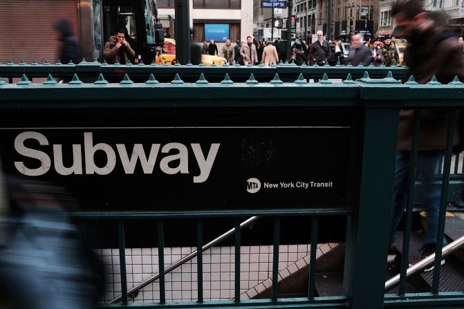
Launched in 1957, Helvetica's minimalist and unassuming aesthetic made it versatile, and one of the most used fonts of all time. Easy to read, it has been adopted by many public transport systems, including the New York subway.
Spencer Platt/Getty Images
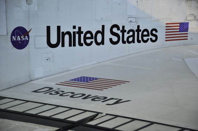
Helvetica is used by many official government bodies, including NASA. It's seen here on one of the agency's space shuttles.
Karen Bleier/AFP/Getty Images
German carmaker BMW even had its own version of Helvetica designed: "BMW Helvetica" is slightly bolder than the original.
Christof Stache/AFP/Getty Images
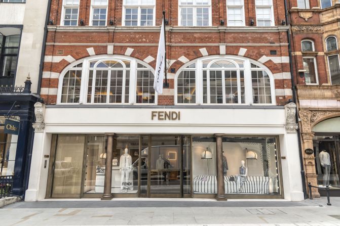
A brand favorite, Helvetica has been used to create many well-known logos including Fendi, American Apparel, Jeep, LG, Lufthansa, Panasonic, Standard Chartered, Target and WhatsApp, to name a few.
Dave Rushen/SOPA Images/LightRocket/Getty Images
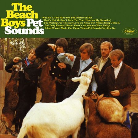
Created in 1922 by designer Oswald Bruce Cooper, Cooper Black became a staple in 1960s and '70s pop culture. The Beatles used the curvy font for their 1964 album "Twist and Shout," but it was the 1966 album cover for "Pet Sounds" by The Beach Boys that cemented its popularity.
Alamy
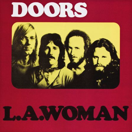
Cooper Black was also used by The Doors for the cover of their album "L.A. Woman" in 1971.
Alamy
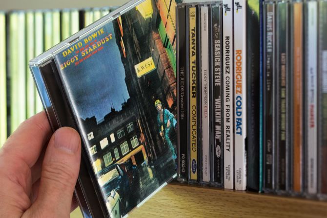
The font appeared again on the cover of David Bowie's 1972 album "Ziggy Stardust," cementing its place in the font hall of fame. Since then, it has featured on everything from Nissin ramen packets to Andy Warhol's pop art.
Alamy
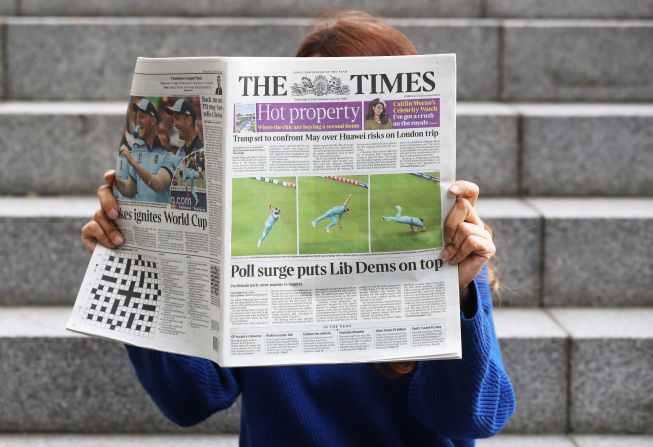
Designed as a narrow typeset to fit more text per line, Times New Roman was developed for the Times of London in 1929. The newspaper has changed its typeface to variations of Times New Roman over the years to fit with its changing shape and size -- most recently, to Times Modern in 2006.
Jonathan Brady/PA Images/Getty Images
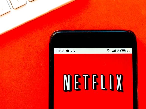
Graphique's eye-catching, retro, all-caps typeface was designed by Hermann Eidenbenz in 1945, and most famously used by Netflix until 2014. The streaming service has since updated its logo to the more minimalist red-on-white Bebas Neue font, but the Graphique version still exists in many places on the platform.
Igor Golovniov/SOPA Images/LightRocket/Getty Images
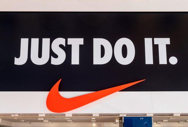
A product of Germany's Bauhaus design movement, Futura was developed by Paul Renner and the Bauer Type Foundry in 1928. It was based on geometric shapes and has been used to great effect in the logos of big-name brands including Nike, Red Bull and Gillette.
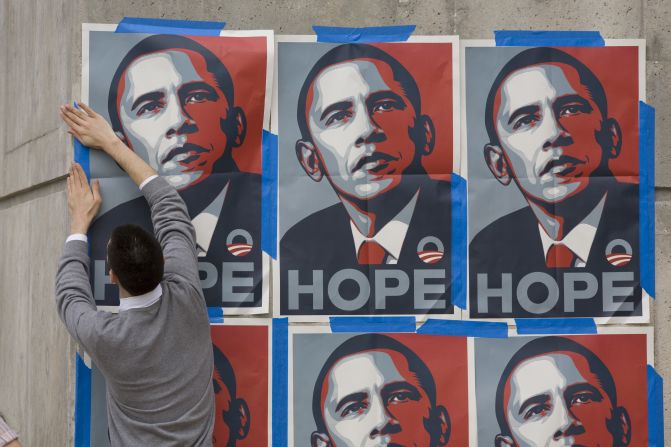
Gotham typeface was originally commissioned by GQ magazine, and designer Tobias Frere-Jones took inspiration from the functional style of New York signage. It gained renown during Barack Obama's 2008 presidential campaign in his iconic "Hope" and "Change" posters.
Robert Daemmrich Photography Inc/Corbis/Getty Images
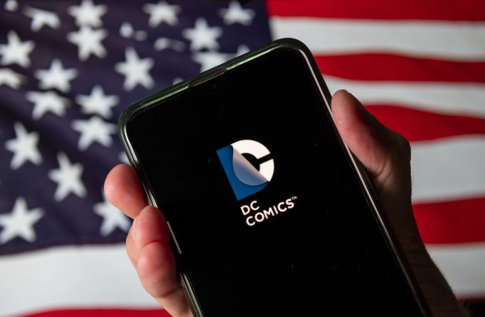
Sharing its name with the fictional city in the Batman comics, Gotham Bold was fittingly used for the DC Comics logo until 2016.
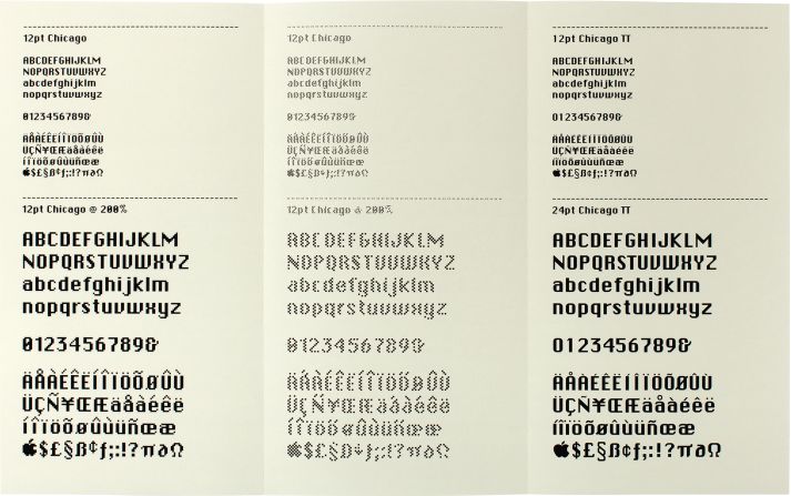
A pixel-based typeface for the digital age, Chicago was designed by Susan Kare as a user-friendly font for the first Apple Macintosh Computer in 1984. Its name allegedly came from Apple founder Steve Jobs, who wanted the company's custom fonts to be named after cities around the world.
Courtesy Paul McNeil
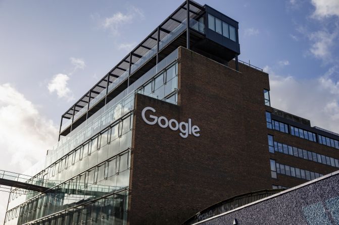
In 2015, Google retired its classic Catull font for the modern and simple Product Sans typeface that we know today. Rounded and geometric, the new logo still retained the slight rotation of the 'e'.
Hollie Adams/Bloomberg/Getty Images
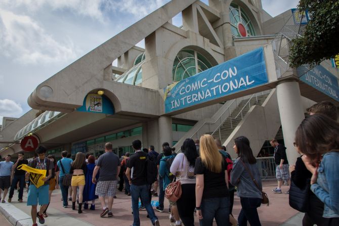
Designed by Microsoft as a cheerful alternative to the serious Times New Roman font, Comic Sans was inspired by comic books. Unlike Helvetica, overuse has been its downfall: its misuse in often formal or professional situations led to a campaign demanding it be banned.
Shutterstock
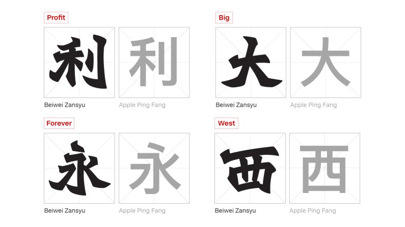
Hong Kong type designer Adonian Chan has created a new font called Beiwei Zansyu. It's a digitized version of Beiwei Kaishu, a Chinese calligraphy style that originated in 4th century China. The style became popular for use in Hong Kong street signs during the 20th century, but is now disappearing from the city. Chan is digitizing it, in a bid to save it from extinction. Compared to many Chinese fonts, Beiwei Zansyu has a bold and dynamic style.
Adonian Chan
Sweetheart Garden Restaurant is a local Hong Kong cafe, famous for its steak. Its sign is written in the Beiwei Kaishu style. Green and red are commonly used in neon signs in Hong Kong because of the high contrast, says Adonian Chan.
Adonian Chan
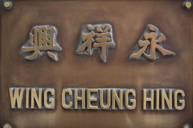
Wing Cheung Hing is a medical equipment supplier -- with a plaque written in the Beiwei Kaishu style -- in Hong Kong's Sheung Wan district. The shop is surrounded by Traditional Chinese Medicine stores on busy Wing Lok Street.
Adonian Chan
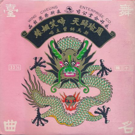
Recorded in 1964 by Cantonese opera stars Cui Miao Zhi and Sun Ma Sze Tsang, this vinyl album uses Hong Kong's Beiwei Kaishu style calligraphy on its cover.
Adonian Chan
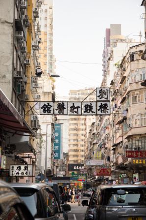
Lau Biu Chiropractor, a Chinese medicine practitioner specializing in bone setting in Kowloon's Yau Ma Tei district, is another company with a Beiwei Kaishu sign. Hong Kong's private clinics often use black and white in their signage, says Chan.