Some Ancient languages didn’t have a word for the color blue. In fact, ancient Egypt is believed to be the first civilization to describe it, having named the color of blue stones discovered while mining.
Yet now, influential research bodies like the Pantone Color Institute comb the world for hues – like Mimosa, Marsala, and Greenery – whose names elicit as vivid emotions as their corresponding colors do.
The wide variety of colors found in design and marketing mirror our existing emotions and promote new ones. Like reading, exposure to colors is part of our education.
How colors change the way we think, feel and consume
A branding tool
As language evolved, so too did our ability to notice certain colors and draw associations from them. “Eighty percent of human experience is filtered through our eyes,” says vice president of Pantone Color Institute, Laurie Pressman.
“With its ability to unconsciously influence us physiologically and psychologically, color is not only the single most important design element in creating mood, but it is also your most significant communication tool to convey a message.”
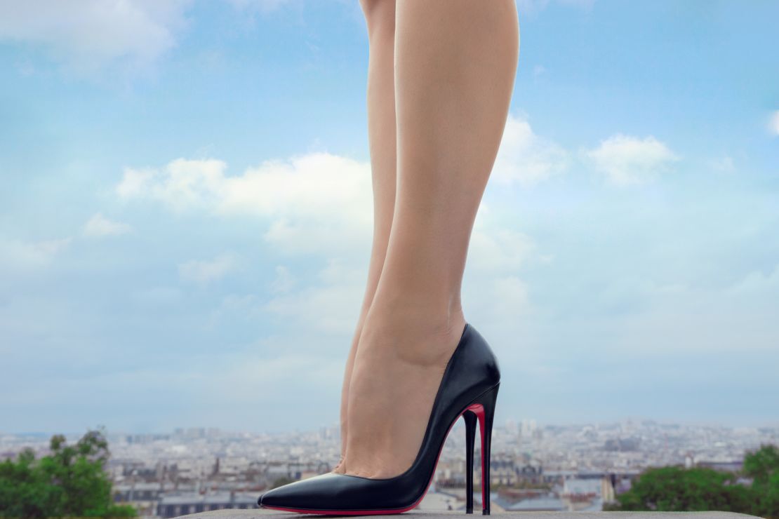
It wasn’t until 1995 that the US Supreme Court decreed that a single color could function as a trademarked brand. Home insulation company Owens Corning launched the “Think Pink” campaign to protect its unique pink hue, setting a precedent for Cadbury’s deep purple chocolate wrappers, UPS’s Pullman brown logos, Tiffany & Co.’s robin egg blue jewelry packaging and Christian Louboutin’s red shoe soles.
Promoting authenticity through color discourages the production of counterfeits. But beyond this, color branding promises dependability, in a psychological – rather than functional – sense.
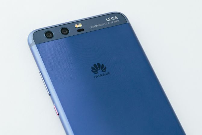
Take phone manufacturer Huawei, which teamed up with Pantone in February to create a line of P10 devices in Dazzling Blue and Greenery – Pantone’s color of the year for 2017. The colors are not only found on the phone itself, but on the home screen and menus too.
“Mobile devices are becoming another smarter window through which to see and interact with the world,” said chief marketing officer of Huawei Consumer Business Group, Glory Zhang.
“The color of the device in your hand, or on the table, is at the periphery of a visual, data-driven and information-based journey. The color can affect your point of view or mood, while making a statement in its own right.”
A moment in time
We influence trends as much as trends influence us. Colors that gain traction – whether used for wall paint or makeup, for example – reflect what’s happening in the wider world. According to senior color marketing manager at PPG Paint, Dee Schlotter, the colors that dominated home decor after 9/11 included soft pink and dark chocolate, representing feelings of compassion and being grounded respectively.
The economic downturn of 2008 meant that off-white walls shifted to grey, a nostalgic hue evoking better times. Cobalt blue, the “bluest” blue yet, made headlines for embodying the shade in its absolute form. So did the “blackest black” and the “pinkest pink,” whose extreme clarity represents our need to seek truth, said Schlotter.
But within those extremes lie a spectrum of shades so nuanced, they beg the question of whether – and under what circumstances – we see them at all. Despite trends, dark colors often prevail – especially in home design – because they can promote notions of academia or receiving an inheritance, Schlotter adds. And more practically speaking: They “ground” bright shades.
Putting color into context
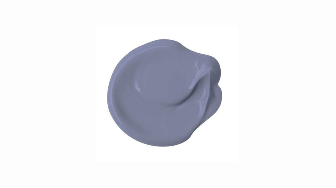
PPG color of the year, Violet Verbena, supposedly creates a sense of community in a divided world. Its combination of lilac and moody grey (with blue undertones) promotes a blended society consisting of gender neutrality, a healthy work-life balance and cohesion between millennials and baby boomers. But the color doesn’t exist in a vacuum – it conveniently complements on-trend matte black appliances and furniture.
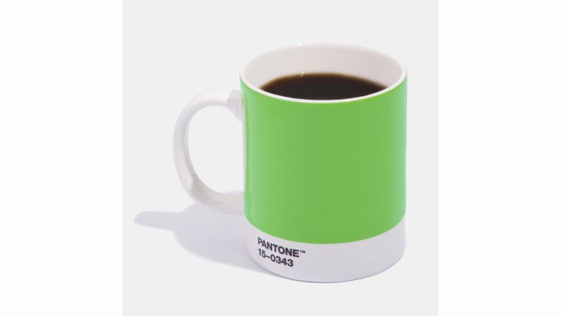
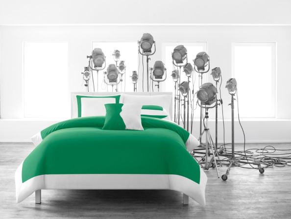
Intriguingly, Pantone’s color of the year, Greenery, lies on almost the opposite side of the color spectrum from its PPG counterpart. Yet it offers a similar level of comfort and energy. Research shows that hues found in nature, like bright green with hints of blue, can have a soothing effect in places we feel unwillingly held, like schools, offices, hospitals and prisons.
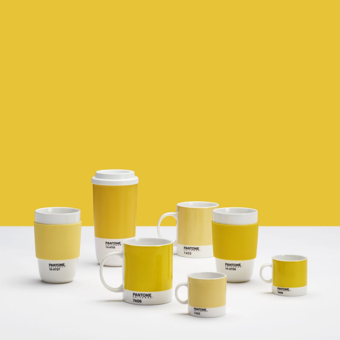
Yellow echoes the vitality of the sun, improving focus and memory and alleviating anxiety, according to Pressman. With this theory in mind, she partnered with Room Copenhagen to create office supplies – including to-go cups, storage boxes and notepads – that strategically promote productivity and intellectual curiosity.
Black is back
In PPG Paints’ 100-year history, it had never have named a shade of black as its color of the year. But for 2018 (PPG predicts trends a year before they’re released to the public), it chose Black Flame. The color supposedly serves to protect and strengthen, inspiring a feeling of confidence in precarious sociopolitical climates. It was unanimously chosen by 26 PPG staff from six countries.
Schlotter says that Black Flame restores the sense of privacy lost to our ever-present mobile devices. The void of color in Black Flame “burns down the forest and allows us to recharge anew,” she says.
Sourcing trends
While we react stronger to colors that evoke our environment, they will fail to catch on unless they’re faithfully represented in the materials we interact with – from glossy mobile devices to textured, sandblasted walls.
But the answers are often found in our backyards, or rather, our screens. The Pepto-Bismol-esque Millennial Pink has been coating our environments since the 1980s. But it’s only recently re-entered our radar because of Instagram. “[Instagram] significantly contributes to the direction in which the latest colors, hues, palettes and textures go,” says Huawei’s Glory Zhang. “It has the power to indicate what has been and what is coming.”
Artificial intelligence, big data and our evolving relationship with machines will, according to Zhang, spur progress in understanding and interacting with color – in both real and virtual worlds. “Technology will broaden and widen our palettes as consumers.” she says. “Businesses will have more tools – more brushes to paint with.”