How colors change the way we think, feel and consume
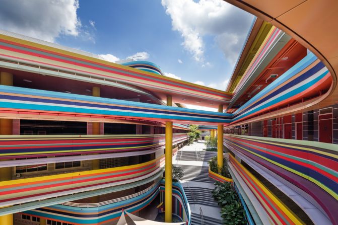
Nanyang Primary School by studio505 and LT&T architects is an eye-catching, colorful extension and rebuild of an existing primary school and kindergarten in Singapore was designed around a generous internal communal space.
John Gollings/ courtesy of studio505 and LT&T architects
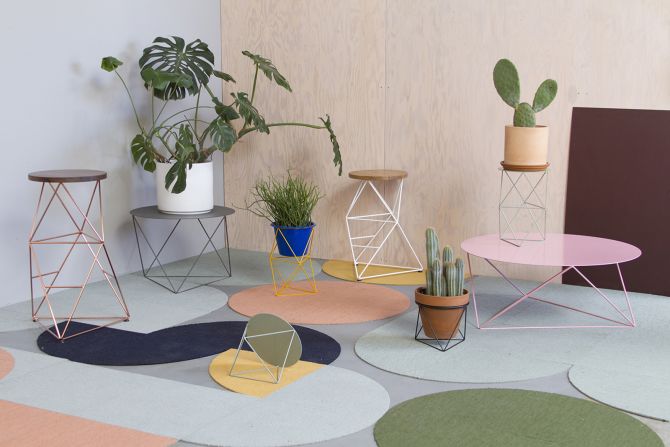
A colorful series of tables "Octahedron Family" by designer Eric Trine, was presented at this year's London Design Festival.
london design festival/Eric Trine
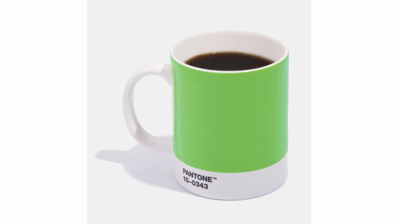
Pantone's color of 2017, Greenery.
pantone
Pantone, the company that considers itself an authority on colors in consumer trends, named Rose Quartz and Serenity as their colors of the year for 2016. The two colors reflect "connection and wellness as well as a soothing sense of order and peace," the company said.
Courtesy For Love and Lemons
Pantone and Room Copenhagen teamed up to create office supplies -- including to-go cups, storage boxes and notepads -- that strategically promote productivity and intellectual curiosity, through the use of color.
PANTONE
In 2014, the color Radiant Orchid won out. Pantone makes its annual color choice by surveying fashion executives and following trends in travel, music, movies and technology.
courtesy west elm/pantone.com
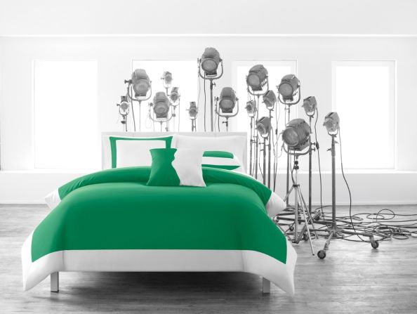
In 2013, Emerald was Pantone's choice for color of the year. The company called it a "symbol of growth, renewal and prosperity."
Courtesy Pantone/JC Penney
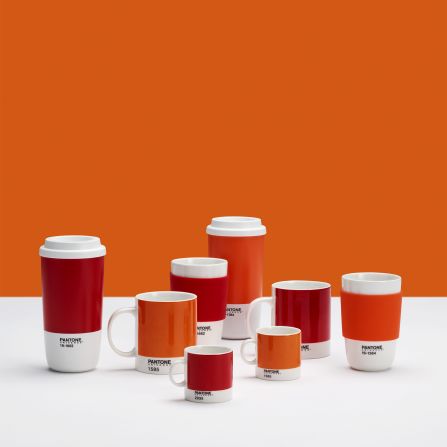
Tangerine Tango was Pantone's pick for color of the year in 2012.
courtesy crate & barrel/pantone.com
Phone manufacturer Huawei, teamed up with Pantone in February to create a line of P10 devices in Dazzling Blue (shown) and Greenery -- Pantone's color of the year for 2017.
Courtesy of Huawei
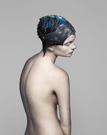
This headpiece by The Unseen, is made of 4,000 conductive Swarovski stones. It changes color to correspond with localized brain activity.
Courtesy of Max Oppenheim
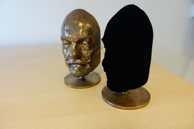
Vantablack, made out of carbon nanotubes, was designed by Surrey NanoSystems. It absorbs 99.96% of all light that hits it.
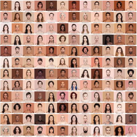
Photographer Angelica Dass says she doesn't believe she'll ever capture every shade of human skin. But after shooting 2,500 portraits she has come closer than any other person to cataloging how far the spectrum of human skin extends.